
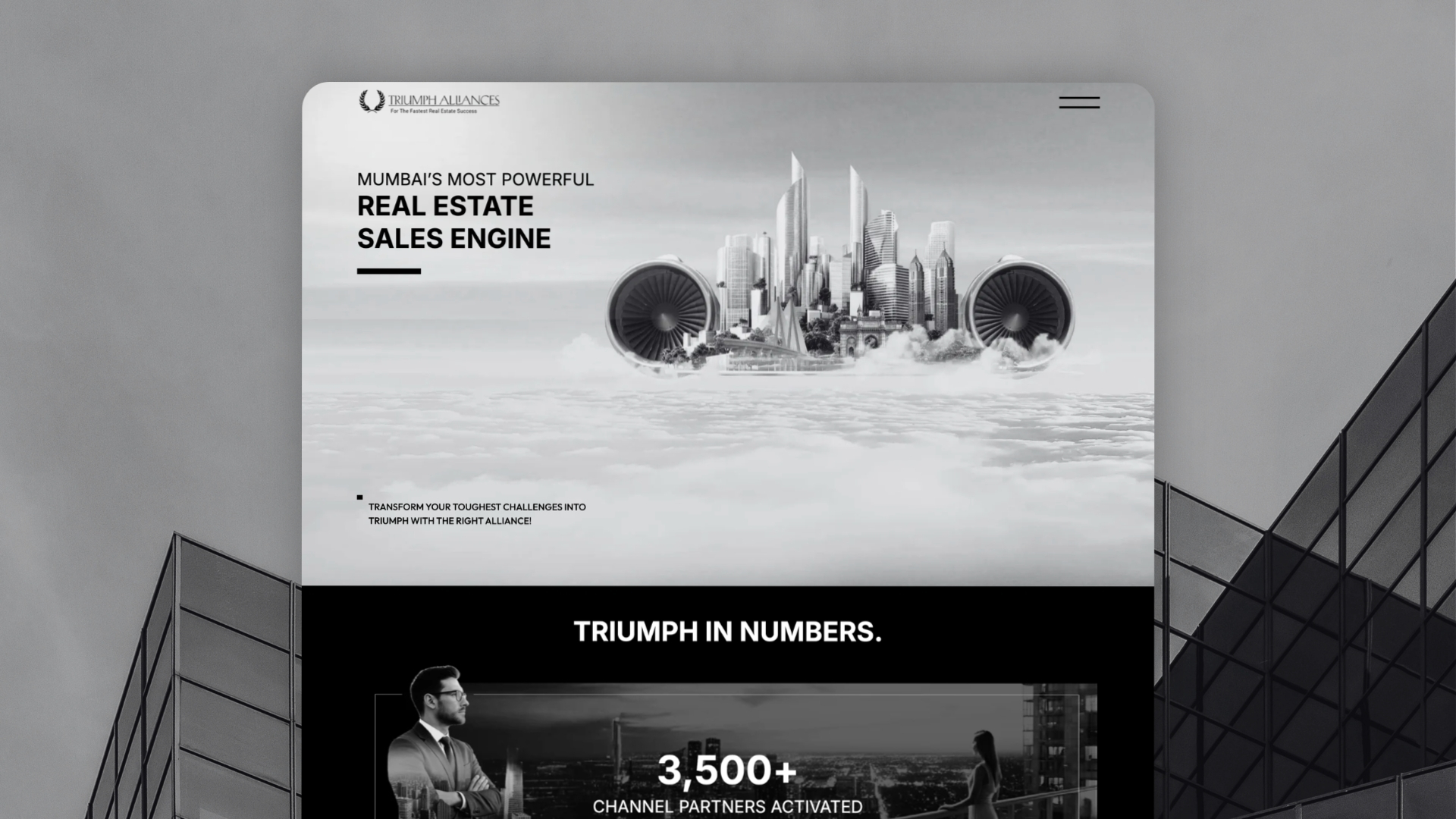
Triumph Alliances had already developed a strong visual identity across its brand and social presence. The next step was translating that direction into a website without losing its character or turning expressive layouts into static, image-heavy compositions.
We built the site using WordPress Full Site Editing and a block-first architecture, translating the brand into responsive, semantic layouts that remain editable inside WordPress. The initial launch focused on a high-impact single-page website, but the underlying system was designed from the beginning to support future pages, content, and services as the firm grows.
Business Context
Triumph Alliances is an advisory firm building a distinctive brand around its expertise and positioning. Before the website project began, its internal team had already invested significantly in defining the visual language across presentations, social content, and other brand materials. The website needed to carry that identity forward while serving a different purpose. Unlike a presentation or social graphic, a website has to work across screen sizes, remain accessible and indexable, load efficiently, and continue evolving as the organisation grows.
The immediate requirement was a primarily single-page website introducing the firm and establishing credibility. But both teams expected the site to grow into a broader multi-page presence over time. That meant Phase One could not simply be treated as a landing page. It needed to establish the foundation for what came next.
Translating Expressive Brand Design to the Web
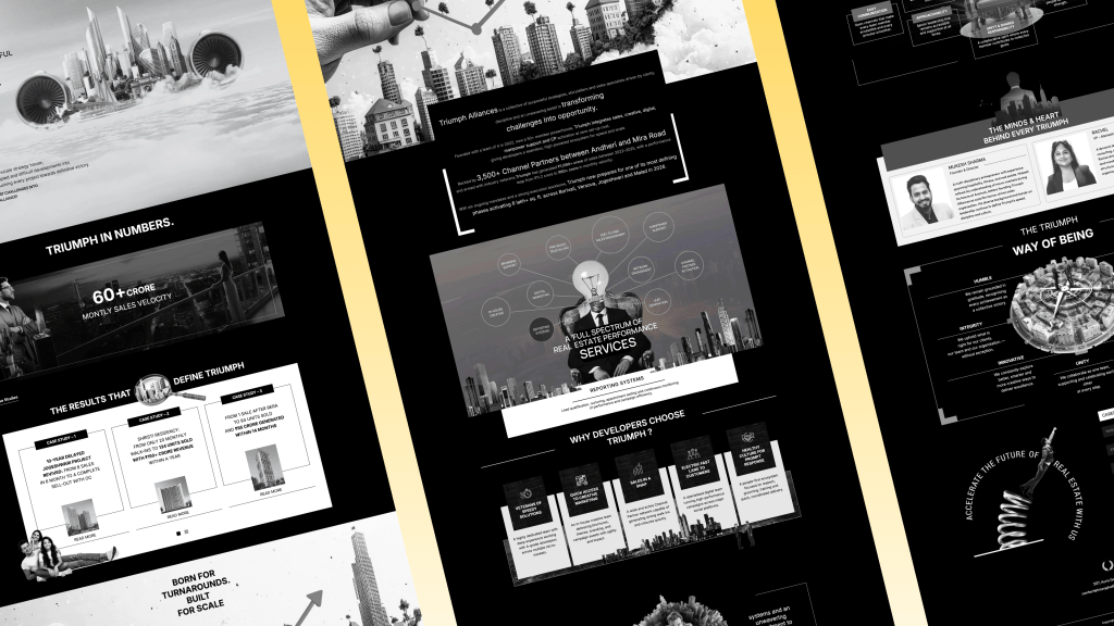
The early design direction used non-grid compositions, layered elements, and presentation-style layouts that gave the brand a distinctive visual character. Those approaches work naturally in static brand materials, but translating them directly to the web can create problems.
One option would have been to flatten complex compositions into images and reproduce the original designs almost literally. That would have preserved the appearance, but at a cost:
- Important text could become embedded inside images;
- responsive behaviour would become harder to manage;
- multiple assets might be required for different screen sizes;
- content updates would depend heavily on designers or developers;
- future pages would become increasingly difficult to build consistently.
We wanted to preserve the character of the design without carrying those limitations into the website. The challenge was therefore not simply achieving visual fidelity. It was finding the right web-native interpretation of the brand.
Design Fidelity Through a Block-First System
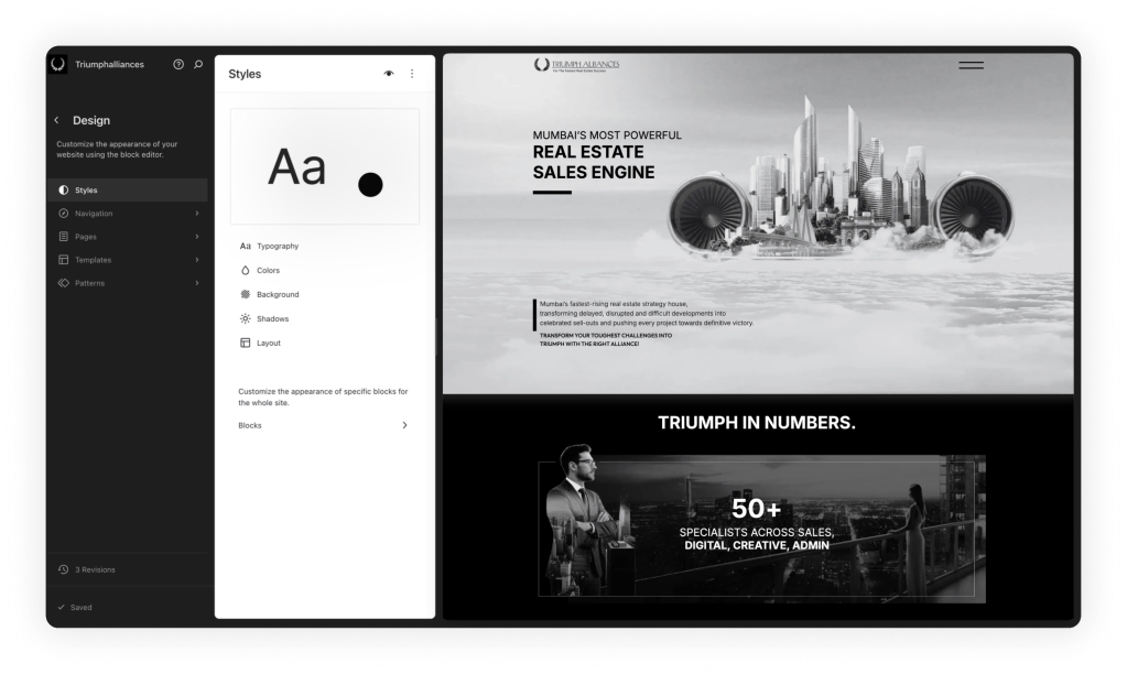
We built the website around WordPress Full Site Editing and native blocks. Rather than hard-coding each composition or treating sections as fixed artwork, we recreated the visual language using structured content, responsive layouts, typography, spacing, and carefully applied styling.
This allowed the website to remain expressive while preserving the things a modern web platform needs: semantic content, editorial control, responsive behaviour, and extensibility. The principle was straightforward: use the brand system as the source of truth, but interpret it through the capabilities of the web rather than reproducing static artwork literally.
01.
Translating the Brand Into Web-Native Layouts
The original visual direction relied heavily on composition, layering, scale, and whitespace. We translated those characteristics into layouts that could respond naturally across desktop, tablet, and mobile rather than relying on fixed-position imagery.
Real text remained real text. Visual elements were separated from content where appropriate. Sections could adapt to different viewport sizes without requiring alternate versions of the same artwork. The result preserved the visual intent while creating a much more resilient implementation.
02.
Building With Native WordPress Blocks
The site was constructed primarily using native WordPress blocks rather than rigid page templates or a third-party page builder. We extended those blocks with custom styles and carefully controlled design options to support Triumph Alliances’ visual language.
Typography treatments, spacing, alignment, and reusable layout behaviours were encoded into the system so editors could work within the brand without manually recreating design decisions on every section.
Where additional flexibility was needed, we introduced targeted Block Editor enhancements rather than creating an entirely separate editing experience. This kept the platform close to WordPress itself while still giving the brand the customisation it required.
03.
Designing Phase One for Future Expansion
Although the first release was primarily a single-page website, the architecture was not built as a one-off landing page. Global typography, spacing rules, block styles, and layout conventions were established with future sections and pages in mind.
That means the site can expand as Triumph Alliances introduces more detailed service pages, insights, team content, and other parts of its digital presence without requiring the underlying system to be rebuilt. Phase One became the first expression of a broader design system rather than a standalone website.
Operational Impact
The finished website gives Triumph Alliances a digital presence that feels aligned with the brand while remaining practical to operate. Content remains selectable, accessible, and indexable rather than being embedded inside presentation graphics. Layouts adapt across screen sizes without relying on duplicated imagery, and the internal team can work with content through the familiar WordPress Block Editor.
Just as importantly, the website is no longer constrained by the scope of its initial launch. The same system can support new pages and content as the organisation grows, allowing the digital presence to evolve without continually rethinking the technical foundation.
Performance was approached in the same way: not as a pursuit of arbitrary scores, but as part of building a clean, efficient, and maintainable website.
What This Means for Brand-Led Organisations
Strong brand identities are often developed first in mediums where the designer has complete control over the canvas. The web works differently. Screen sizes change. Content evolves. Search engines need structure. Editors need control. And the website has to remain maintainable long after the initial design is approved.
The answer does not have to be simplifying the brand until it looks like every other website. The better approach is to understand what makes the visual identity distinctive and recreate those qualities using web-native systems. For Triumph Alliances, WordPress Full Site Editing gave us that middle ground: enough flexibility to preserve an expressive brand while providing the structure needed for long-term growth.
The Final Takeaway
The Triumph Alliances project was not simply about converting a design into WordPress. It was about translating a visual identity from static brand materials into a flexible digital system.
By combining a block-first architecture, Full Site Editing, responsive layouts, and targeted editor enhancements, we created a website that preserves the character of the brand without becoming difficult to edit or extend. The first phase may have started as a single-page website, but the foundation was designed for everything that comes after it.
Want Your Brand to Feel Like Your Brand Online?
Tell us what you’re building and where you want to go next – we’ll help you find the sensible next step.