
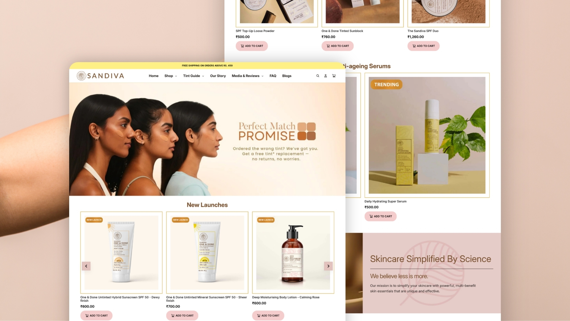
Sandiva Skincare was successfully driving paid traffic to its ecommerce store, but too many visitors were dropping out before completing a purchase. We used analytics, heatmaps, and session recordings to identify where the buying journey was breaking down. The findings pointed to friction across the mobile experience, particularly around product discovery and checkout.
We redesigned the website around a clearer mobile purchase journey, restructuring product pages, simplifying navigation, and streamlining checkout. The result was a significant improvement across the conversion funnel.
+41%
Mobile conversion lift
-28%
Cart abandonment
+64%
Checkout completion
Business Context
Sandiva Skincare is an Indian direct-to-consumer skincare brand combining traditional ingredients such as sandalwood with modern formulations. Its product range focuses heavily on sun protection and skincare designed for Indian skin tones.
As Sandiva increased its investment in performance marketing, paid campaigns were successfully bringing more potential customers to the website. But traffic growth was not translating proportionately into sales. Before increasing ad spend further, the team needed to understand what was preventing visitors from completing their purchases.
The Challenge: Strong Traffic, Weak Conversion
Sandiva was already solving the acquisition problem. Its campaigns were generating consistent traffic, visitors were exploring products, and many were adding items to their carts.
The problem appeared later in the journey. Too many sessions ended before checkout was completed, limiting the return Sandiva could generate from its growing marketing investment.
Rather than immediately increasing campaign budgets or changing targeting, the priority was to understand whether the website itself was creating friction.
Our Approach: Diagnose Before Redesigning
We started with the behavioural and analytics data already available to the team. Google Analytics showed that the majority of traffic was coming from mobile devices. Campaign data also indicated that paid acquisition was reaching users with genuine purchase intent.
That shifted the focus away from the advertising funnel and toward the ecommerce experience itself. Session recordings and heatmaps helped reveal where users were struggling. The patterns pointed to several connected issues:
- navigation made the journey harder than necessary on smaller screens;
- product pages did not always guide users clearly from product information to purchase;
- important content and buying actions felt disconnected;
- the checkout process introduced unnecessary steps at the most critical stage of the funnel.
The opportunity was therefore broader than improving a single screen. The entire mobile journey needed to feel more continuous.
The Solution: Redesigning Around the Purchase Journey
We redesigned the website with mobile conversion as the primary consideration. This was not simply a visual refresh. The work focused on reducing friction between arriving on the site, understanding a product, deciding to buy, and completing checkout.
01.
Product Pages Built for Decision-Making
Skincare purchases often depend on trust and product understanding. Customers want to know what a product does, which ingredients it contains, how it fits into their routine, and whether it is appropriate for their skin before committing to a purchase.
We restructured the product pages so this information supported the buying decision rather than competing with it. Product benefits, ingredient information, brand messaging, and purchase controls were brought into a clearer hierarchy. We also reduced unnecessary visual clutter around primary actions, making it easier for visitors to move from evaluation to purchase.
02.
A Mobile-First Shopping Experience
Because mobile represented the majority of Sandiva’s traffic, the interface was redesigned around how visitors actually browsed on smaller screens. We improved content readability, simplified navigation, and positioned purchase actions where users were most likely to need them.
The objective was straightforward: reduce the effort required to move through the store without removing the information customers needed to make confident decisions.
03.
A Simpler Path Through Checkout
The final stage of the funnel was also one of the biggest sources of abandonment. We simplified the checkout flow and removed unnecessary steps that interrupted customers after they had already demonstrated strong purchase intent. Reducing friction at this stage helped more users move from cart to completed order.
The Result
The redesign improved performance across several important stages of the ecommerce funnel. Mobile conversion increased by 41%, cart abandonment dropped by 28%, and checkout completion increased by 64%. The before-and-after product-page comparison also shows the practical change in experience: the revised page creates a clearer relationship between imagery, product information, variants, pricing, and the primary purchase action.
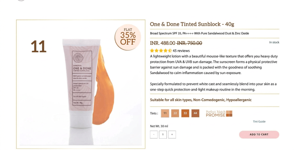
Old Single Product Page

New Single Product Page
“It was a great experience working with the team at Lubus. They were prompt, efficient, and handled the project seamlessly from start to finish. The end-to-end support, especially the knowledge transfer session, was extremely valuable and helped ensure a smooth handover.”

Arjun Santhanam
Founder

Operational Impact
The project helped Sandiva get more value from traffic it was already paying to acquire. Instead of treating conversion as an advertising problem, the team addressed the experience visitors encountered after clicking an ad.
The redesigned site created a clearer connection between campaign traffic, product discovery, purchase decisions, and checkout. It also gave Sandiva a stronger foundation for future marketing investment: increasing acquisition could now build on a buying experience that was converting more effectively.
What This Means for Growing D2C Brands
More traffic does not automatically translate into more revenue. A campaign can reach the right audience and generate strong purchase intent while the website still introduces enough friction to lose customers before checkout.
That is why conversion optimisation needs to look beyond individual buttons or cosmetic changes. For Sandiva, behavioural data showed that the bigger opportunity was the structure of the buying journey itself. By using those insights to redesign the mobile experience, product pages, and checkout flow together, the website became a stronger bridge between paid acquisition and completed purchases.